Admitease
Marketplace connecting students to 50+ accredited university programs worldwide through a single, guided experience.
As the sole product designer, I:
- Led the end-to-end redesign of website, onboarding, student and admin dashboards
- Built the Admitease design system from scratch and contributed to growth strategy across four acquisition channels
- Set up Microsoft Clarity and GA4 to validate every design decision against real user behaviour
The Problem
01Why were applications not coming through? 🤔
Two stages of the funnel were leaking. Traffic was coming in, applications were not.
Problem 01
Low sign-ups
Visitors had roughly five seconds to understand the product before leaving. The landing page led with abstract language, a vague hero, and one low-commitment CTA. Most could not tell what the platform did or why signing up was worth their time.
Problem 02
Low profile completion
Students who signed up landed on a profile page with no direction and no progress indicator. The form felt long and cluttered, document uploads were stacked at the end, and most abandoned before reaching the application stage.
Process
02From Audit to Validation
Before redesigning anything, I needed to understand exactly where the platform was failing and why. Five phases, not as a linear waterfall but as a continuous loop where each fed the next.
01
Audit
Before touching anything, I walked every screen of the live platform and tested each flow against Nielsen's usability heuristics, CRO funnel principles, and choice architecture theory. I was looking for the real reasons people were dropping off, not surface-level fixes. Every friction point I found became a design decision later. Nothing was changed for cosmetic reasons.
02
Map
With the audit findings in hand, I moved into FigJam and mapped the full student journey from first visit to submitted application, marking every drop-off point and unanswered question along the way. That exercise made one thing obvious: the platform was built around features, not actions. Every screen asked the student to do something without telling them why it mattered.
03
Decide
Once the map was clear, I worked through each friction point and made a deliberate design call grounded in a principle: progressive disclosure for onboarding, choice architecture for discovery, chunked forms for completion. These were not preferences. Each one was a trade-off with a reason behind it, and I documented every call so the team could challenge it if needed.
04
Ship
From there, I worked closely with the co-founder and engineering team to ship in small, testable increments. Onboarding went first because it had the highest leverage on every downstream metric. The dashboard and profile followed, and search came last because it depended on the intent data that onboarding was now collecting.
05
Validate
After we shipped the first version, I worked with the dev team to set up Microsoft Clarity and GA4 to track real user behaviour across the platform. Session recordings, drop-off heatmaps, and completion rates showed us where things were working and where they were not. Most decisions held up. A few sent me back to the map to rethink, and that is exactly what the process is for.
Research & Insights
03Where the platform was losing people
The audit surfaced eight clear friction points across the funnel. I grouped them into three themes, each one describing a different stage where the platform was failing students and the business.
Theme 01 · Activation
"Students were arriving at a product that could not explain itself."
Friction 01
Vague value proposition above the fold
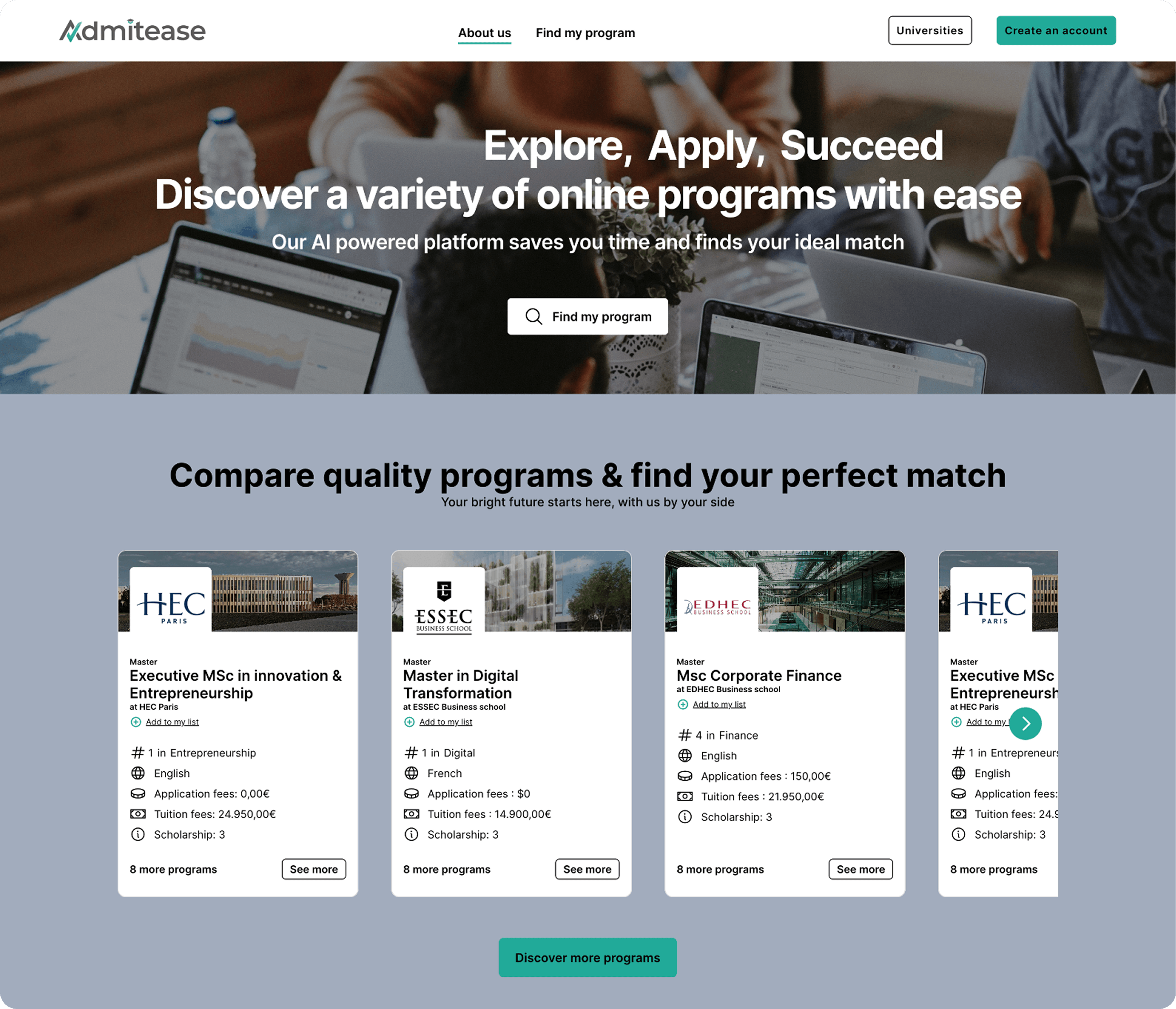
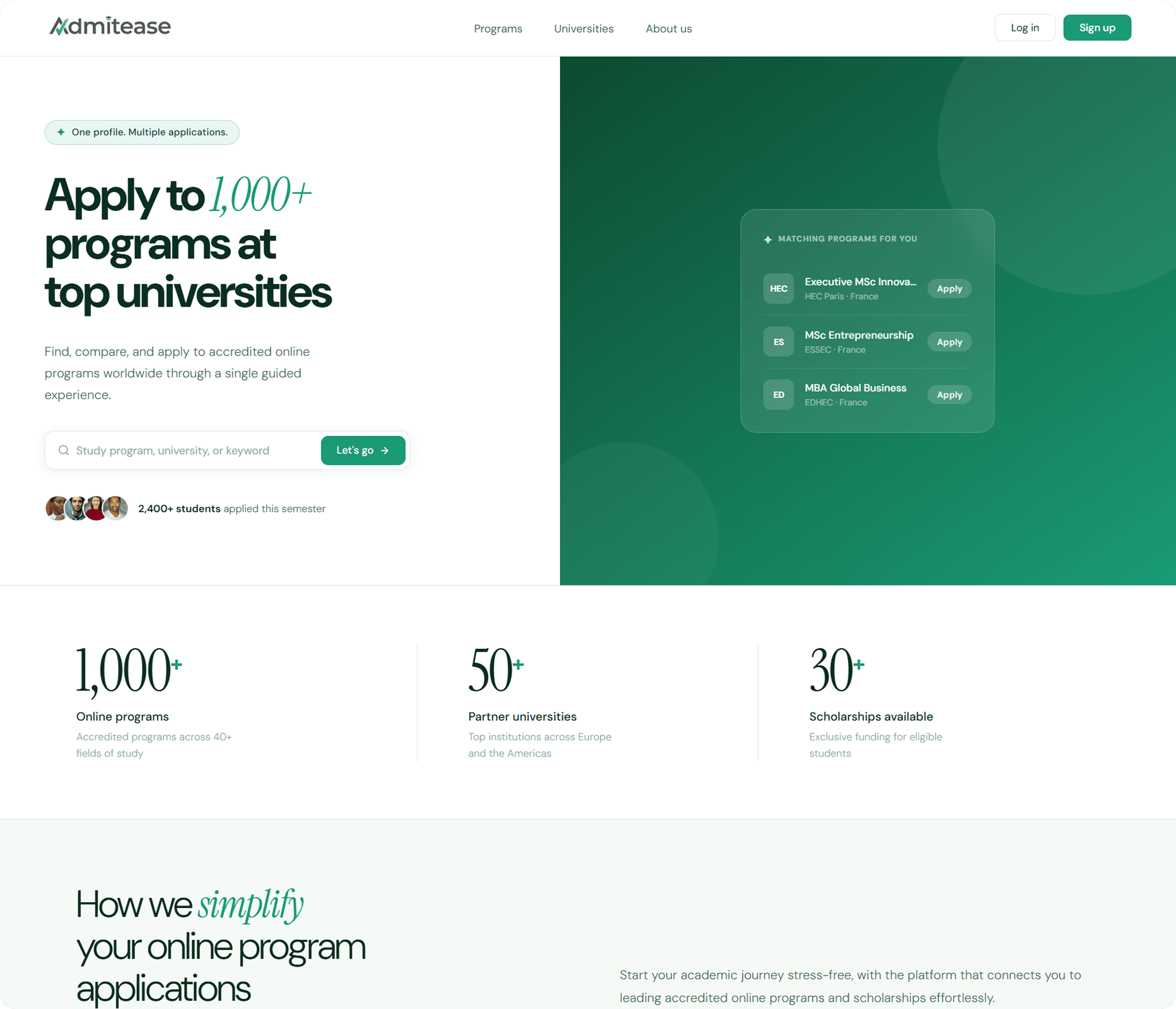
The hero led with "Explore, Apply, Succeed": a tagline that answered nothing. Visitors could not tell what the platform did, and the CTAs were too vague to drive sign-ups even when someone was interested.
ResultA homepage rewrite that leads with the concrete promise and surfaces sign-up as the primary action.
Friction 02
No onboarding layer
Students signed up and landed on a blank profile with no context or direction. Without capturing faculty interests, degree level, or study type upfront, every student saw the same full catalog regardless of what they were looking for.
ResultA four-step onboarding flow that captures intent before the student ever sees the dashboard.
Theme 02 · Discovery
"Thousands of programs with no way to find the right one."
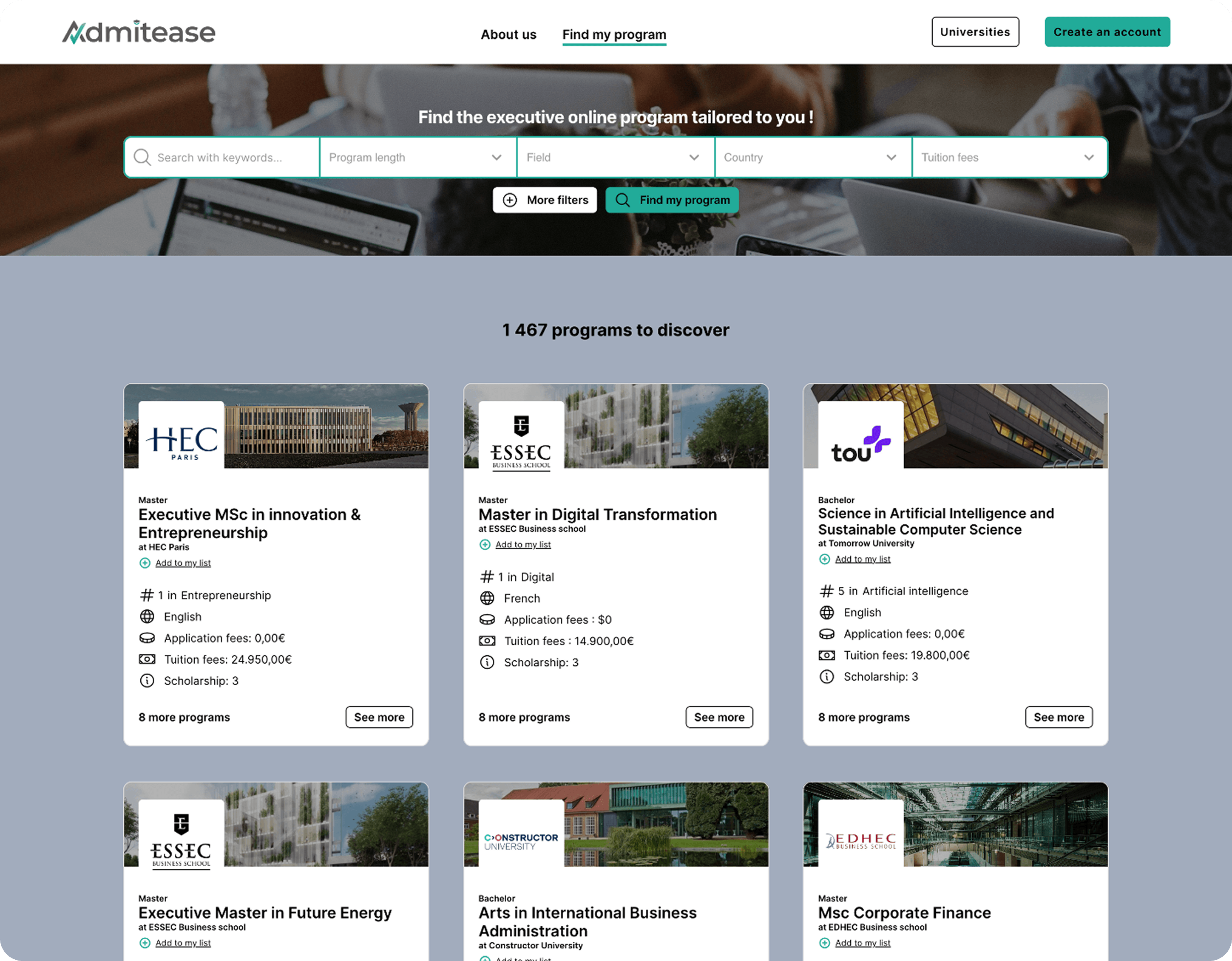
Friction 03
Choice overload on the discovery page
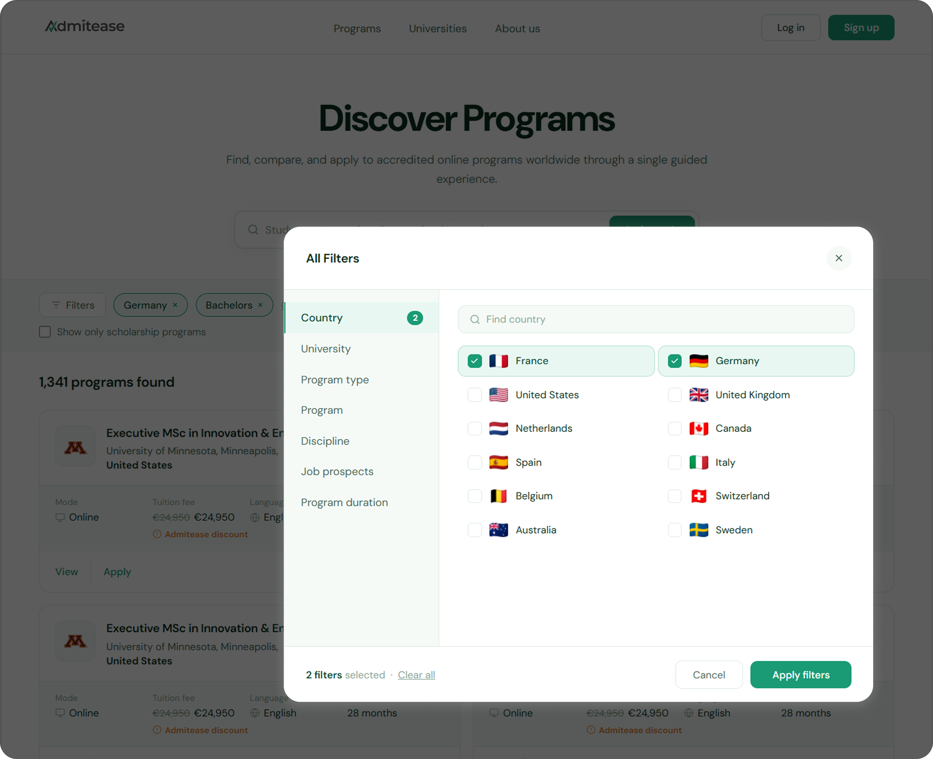
Five dropdowns sat side by side with no visual connection to the search bar. Most students did not realise the filters worked together, and when you cannot find what you need in a catalog of thousands, you leave.
ResultA focused filter modal with categories on the left, options on the right. Selected filters appear as chips below the search bar. The result count updates live.
Theme 03 · Completion
"Students who got through discovery still did not finish."
Friction 04
A dashboard with no sense of progress
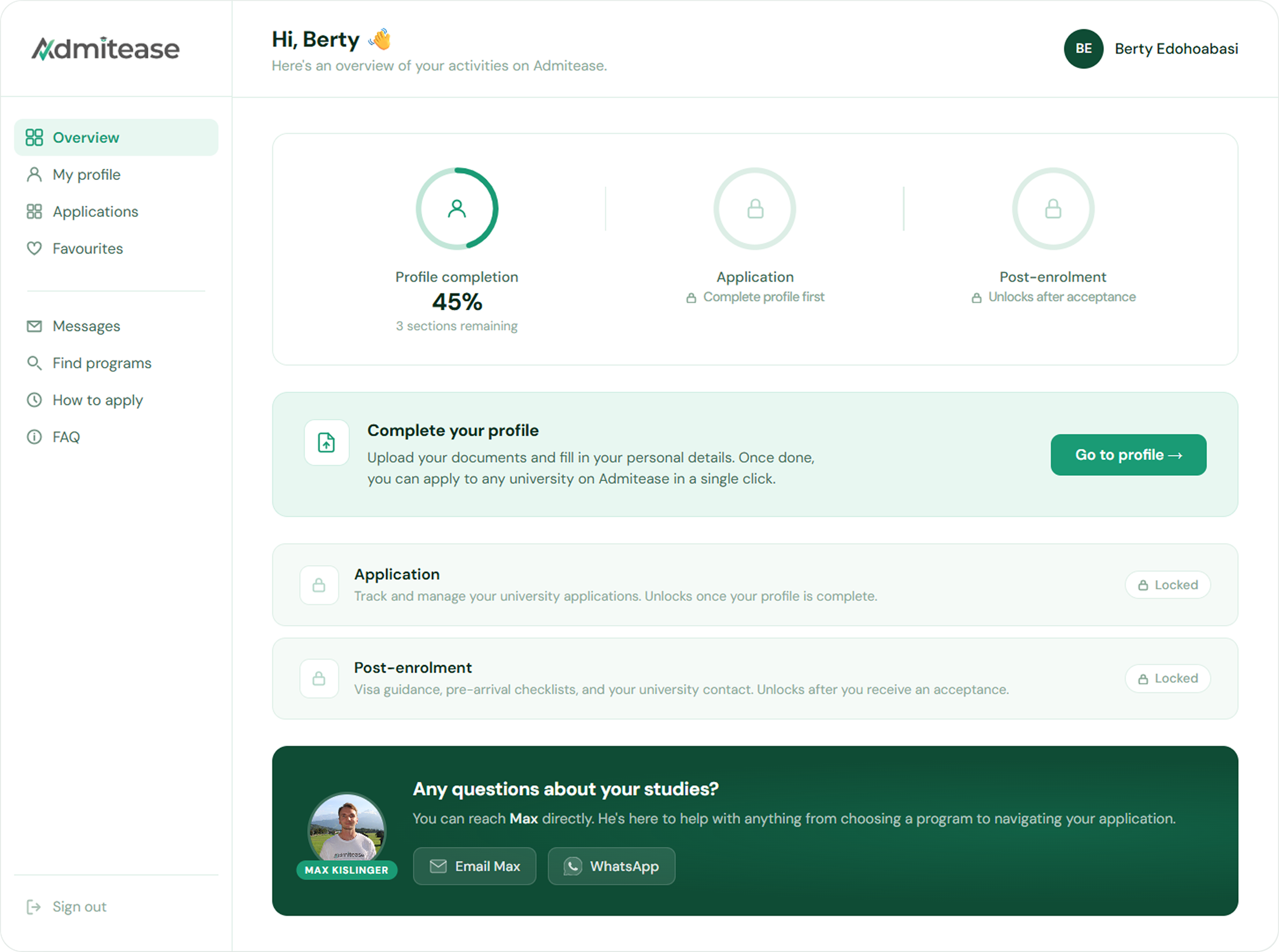
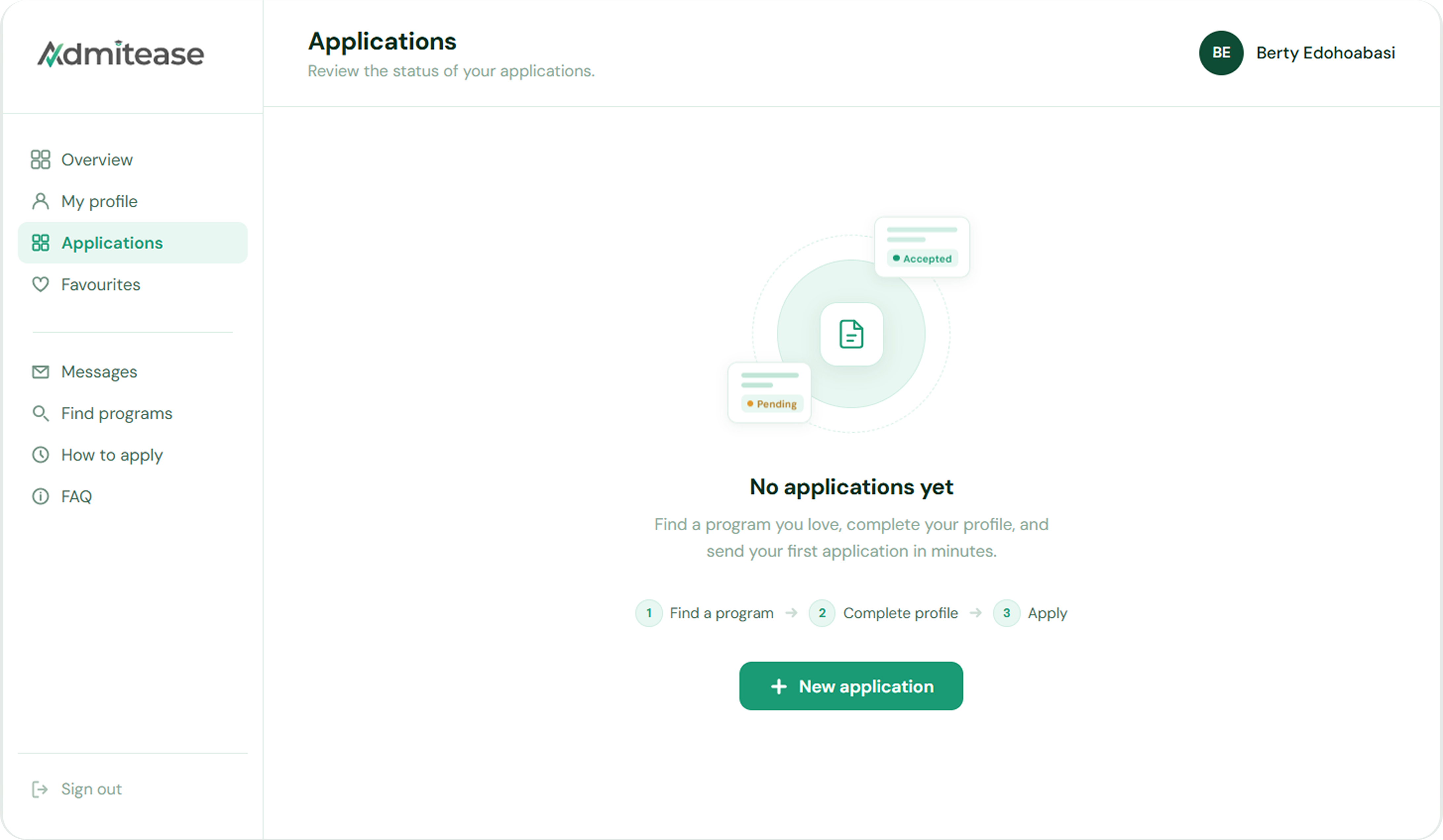
The dashboard showed submitted applications but had no overview, no completion percentage, and no signal about what to do next. Students with incomplete profiles landed on the same screen as those who were ready to apply.
ResultA progressive unlock model with three visible stages. Application and Post-Enrolment stay locked until the profile is complete.
Friction 05
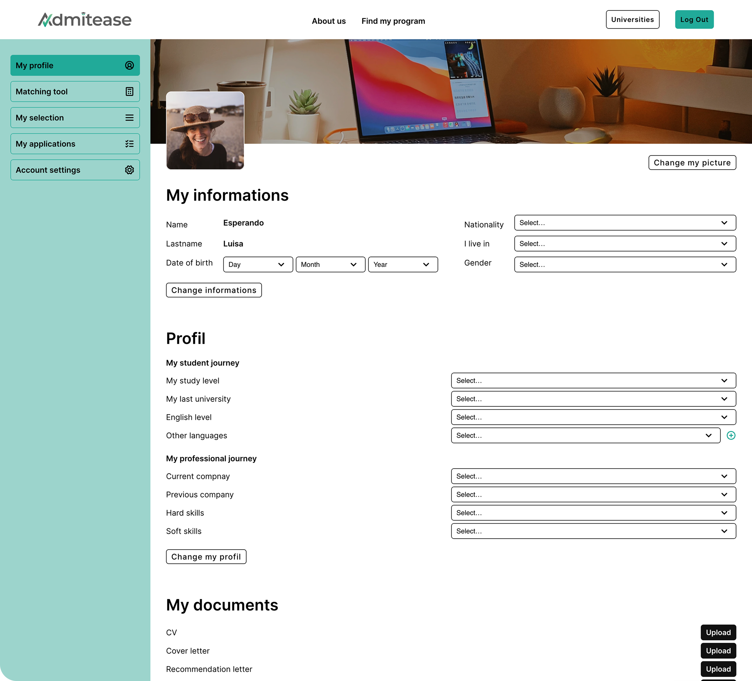
A profile built to feel overwhelming
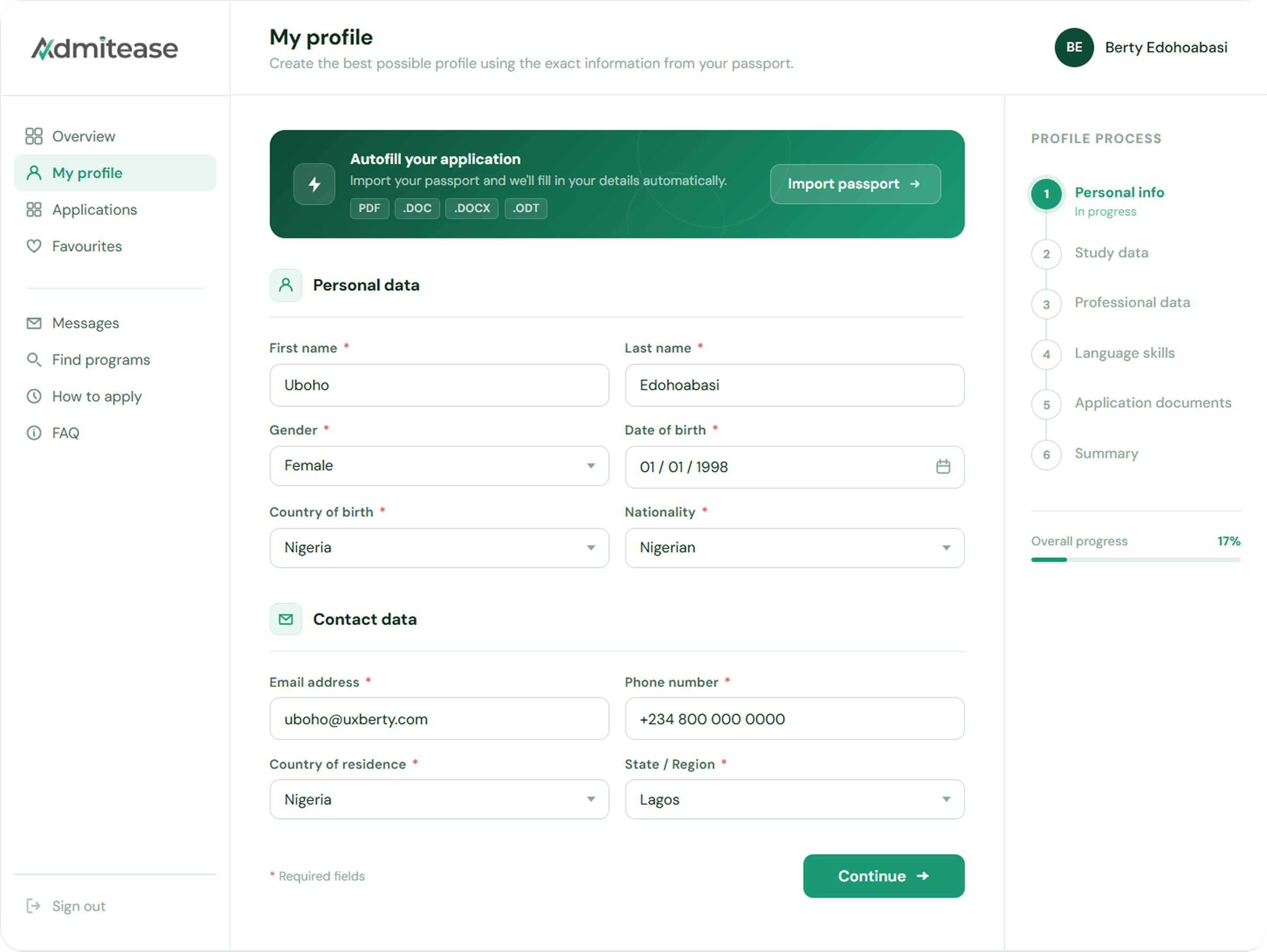
One long scrolling page, no stepper, no separation between required and optional fields, and document uploads stacked at the very bottom. Asking for heavy uploads after a long form is a proven abandonment trigger.
ResultA six-stage profile flow with a persistent stepper and inline document uploads placed inside the relevant sections.
Friction 06
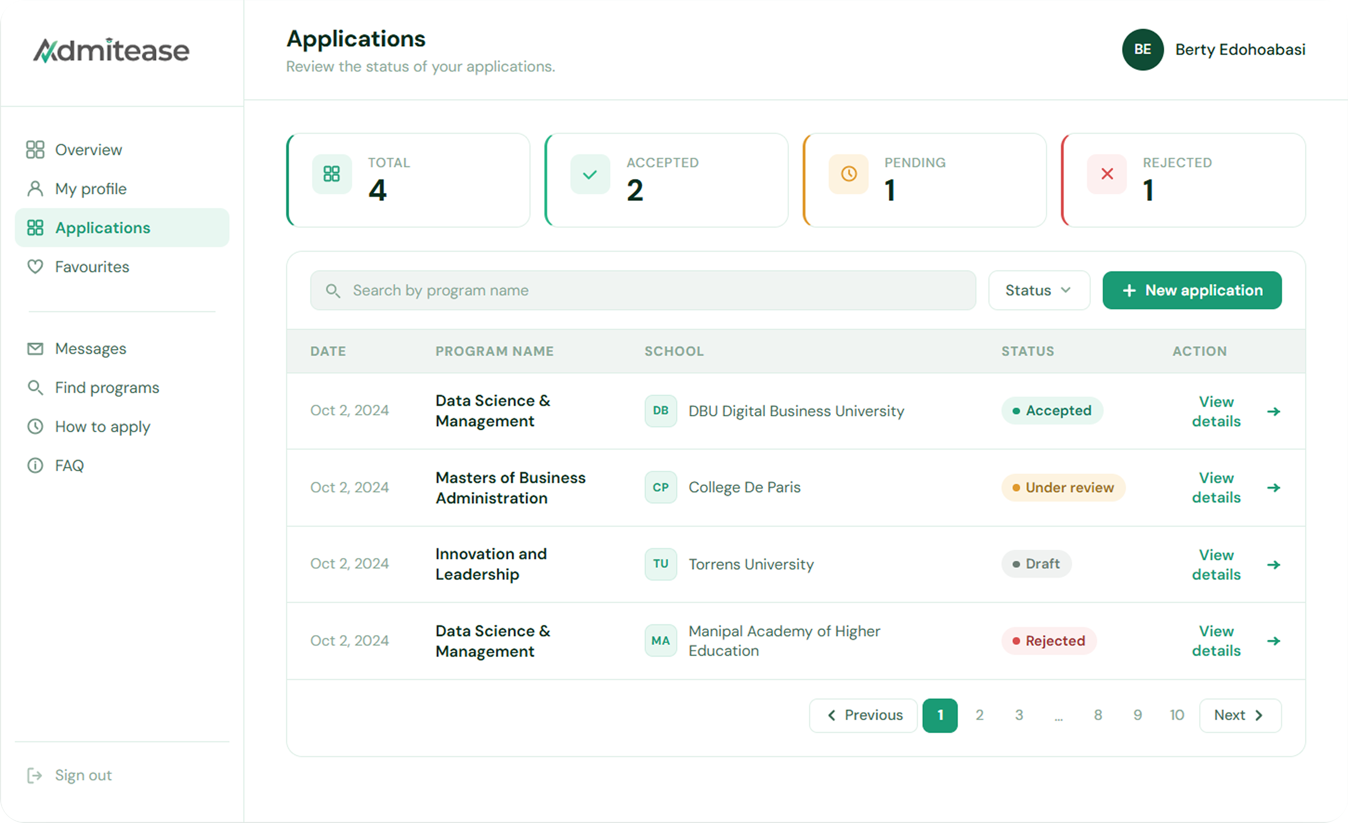
An admin side built for browsing, not managing
The applicant list was a flat, unsortable, unfiltered table. A persistent hero image took up a third of the viewport on every section, cutting the usable area for the data an enrollment manager actually needs.
ResultPrograms and Applications data tables in the admin dashboard, designed for quick scanning with key fields visible at a glance.
"The platform had the right capabilities but failed to communicate them, guide users through the funnel, or build the trust needed for a high-consideration decision like applying to university."
Solution
04Every decision traced back to one question: what does the student need to do next?
Getting students through the door
The first failure happened before sign-up. The landing page could not explain the product, the search experience drove people away, and the sign-up flow dropped students into the platform with no direction. All three had to be fixed before anything downstream mattered.
Homepage
Before
A vague hero with a low-commitment CTA. Visitors could not tell what the platform did.
After
A rewritten page that leads with the concrete promise and surfaces sign-up as the primary action.
Search
Before
Five dropdowns competing for attention with no visible relationship between search and filters.
After
A focused filter modal that organises categories on the left with options on the right. One decision at a time.
Onboarding
After
Three steps. Intent captured before the student sees anything else, and the Interests step narrows the catalog from thousands of programs to a relevant shortlist.
Building a path students could follow
Once inside the platform, students needed to know where they were, what to do next, and how far they had to go. The dashboard, profile, and application were rebuilt as one connected flow.
Dashboard
After
Three visible stages: Profile Completion, Application, and Post-Enrolment. Application and Post-Enrolment stay locked until the profile is done.
Profile
Before
One long scrolling page with no structure, no progress indicator, and document uploads stacked at the end.
After
Six stages with a persistent stepper. Document uploads sit inline with the relevant sections.
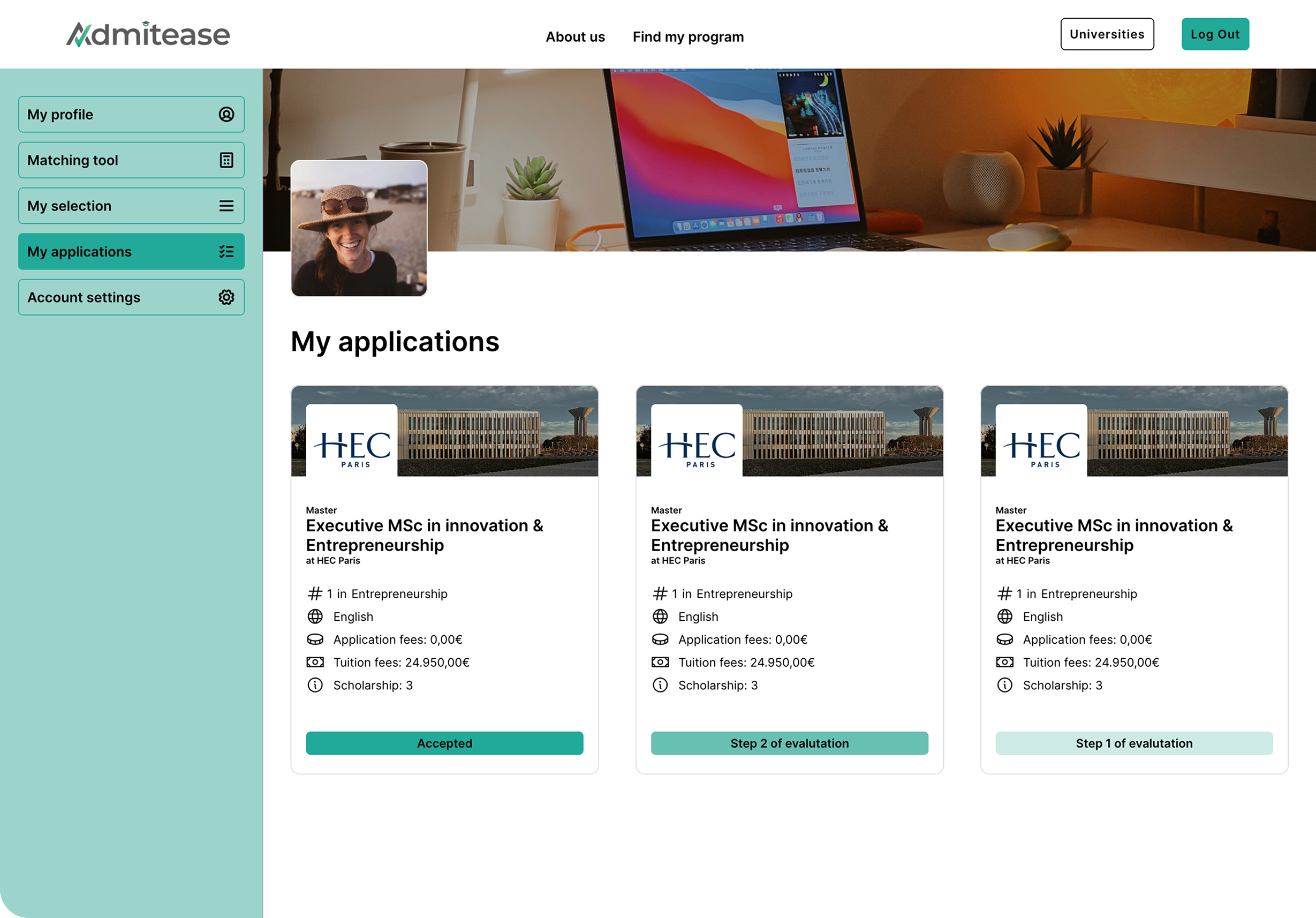
Application
Before
A flat list of application cards with status labels and no structured flow.
After
A guided application process with a stepper, and a dashboard view showing every application with status tracking and totals.
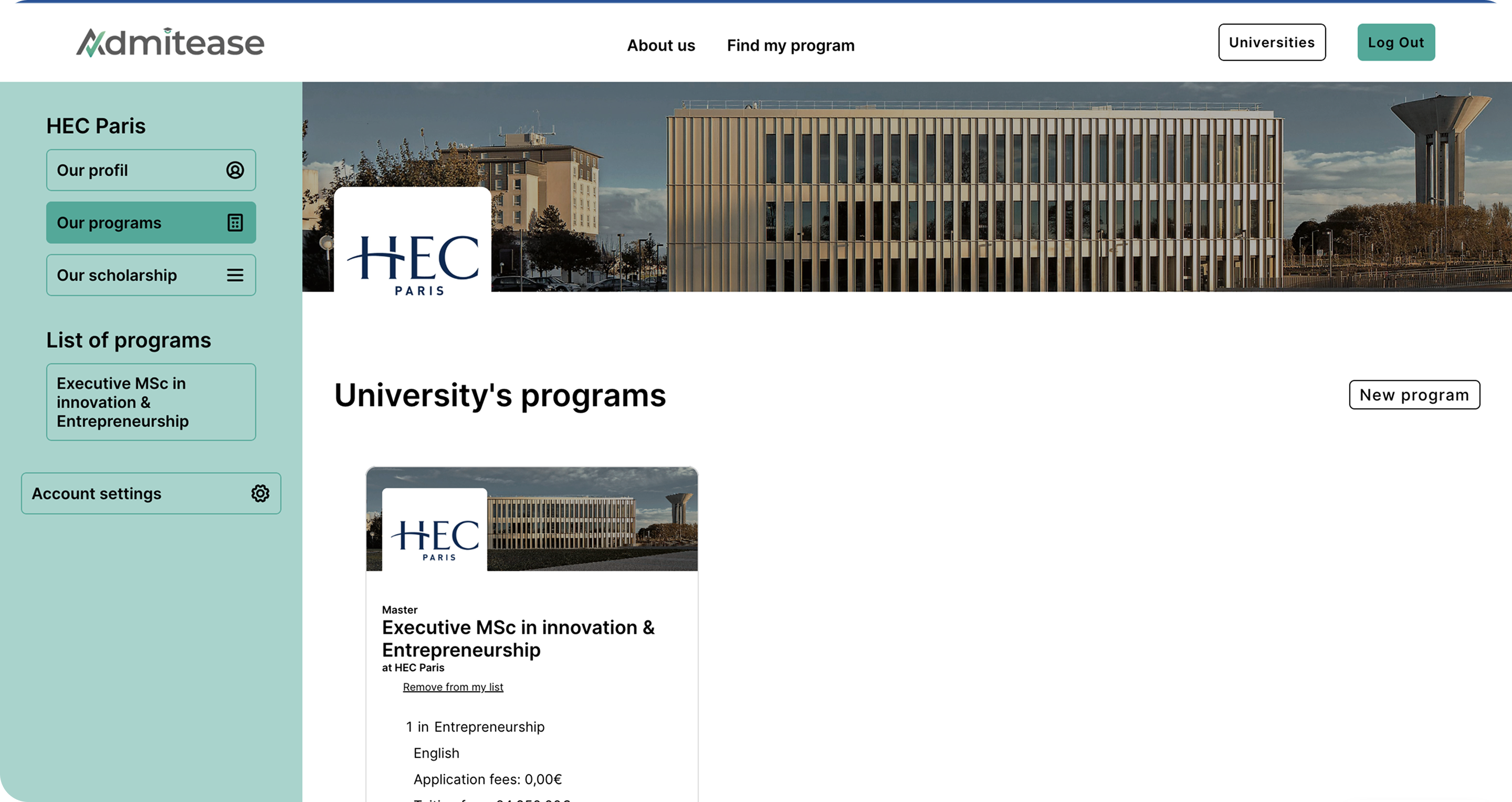
The university side
A marketplace only works if both sides function, students applying, and universities receiving and managing those applications.
Admin Dashboard
Before
A flat applicant list with no sorting, no filtering, and a hero image eating a third of the viewport.
After
Data tables built for scanning. Key fields visible at a glance, action menus on every row.
Impact
05What changed for the business and the people using it
Good design moves numbers. Here is what the redesign delivered for Admitease, for the students applying, and for the universities receiving those applications.

"Berty took her time to really understand our business and the problems we were trying to solve. She approached the redesign from a growth perspective, and that made all the difference. She built our design system, product, and website from the ground up, and showed up like a true co-owner throughout. We are genuinely proud of how everything turned out."
Mehdi RifatCo-Founder & CEO, Admitease
Reflection
06Takeaways
-
01
Progressive disclosure is a growth tool, not just a UX pattern.
Breaking a long flow into smaller steps changes how people experience effort. Students completed a four-step onboarding that would have lost them as a fifteen-field form. The design principle and the business metric were the same thing.
-
02
In a marketplace, search is the product.
The university catalog was the core value, but if students could not find relevant programs quickly, nothing else mattered. Getting search right was not a feature improvement; it was the most important thing on the list.
-
03
Understanding the business changes how you design.
The brief started as a trust problem. Spending time with the founders and mapping the full funnel revealed it needed a complete rethink from acquisition through to application. Design decisions made without that context tend to solve the wrong problem.